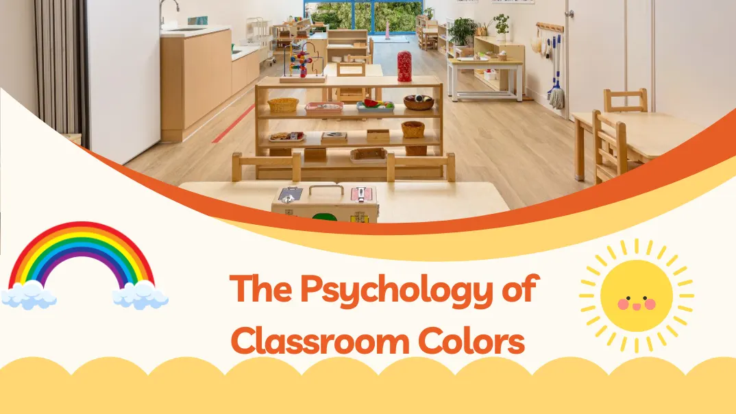
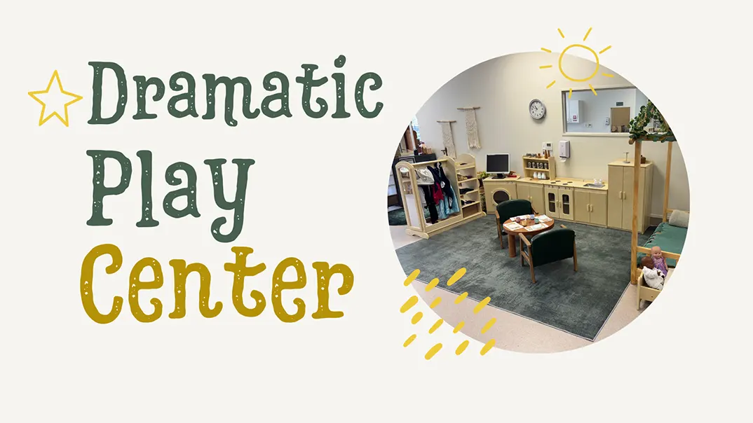
Classroom environments play a critical role in shaping students’ learning experiences. While educational tools, teaching methods, and student-teacher dynamics are essential, one often overlooked factor is the color scheme of the classroom itself. Classroom colors matter because they shape students’ moods, concentration, and learning outcomes. Studies show that specific colors stimulate engagement, calm anxiety, and boost academic performance. Designing classrooms with purposeful colors makes the environment more welcoming and supports better educational experiences.
Without attention to color, classrooms can feel uninspiring, distracting, or even anxiety-inducing—ultimately detracting from the learning experience. We can craft classrooms supporting educational goals by leveraging colors that boost mood, focus, and memory retention.
Examining each color’s psychological impact and how these responses align with educational objectives is essential to understanding how color affects learning. Let’s explore the key colors used in classrooms and their specific effects.
Why Classroom Colors Matter
Classroom colors are more than just an aesthetic choice. They can set the room’s tone, influence emotions, and affect learning outcomes. Research has shown that colors influence cognitive performance, relaxation, and social interactions. For example, while bright, energetic colors like yellow and red might stimulate excitement, calming colors like blue and green can help students focus better.
The psychology of color is crucial when selecting a palette for your classroom. Educators can create an optimal environment fostering growth, attention, and engagement by understanding how various colors impact mood and learning.
The Role of Colors in the Learning Environment
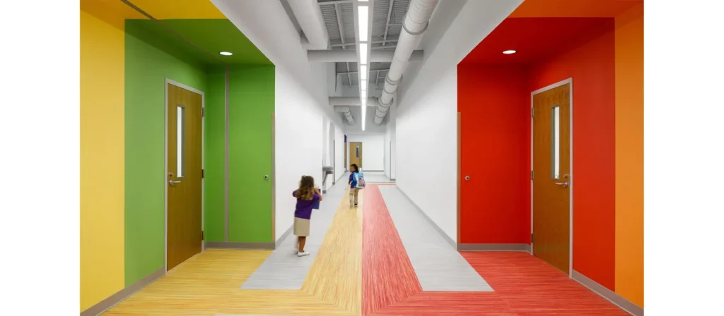
1. The Psychology of Colors and Its Impact on Learning
Classroom colors have psychological effects that can influence students’ behavior, mood, and academic performance. Understanding these effects is the first step in choosing the right colors for a classroom.
- Blue: Often associated with calm and focus, blue is ideal for spaces that require concentration. It promotes a sense of tranquility and can lower anxiety levels. Studies have shown that blue environments can enhance creativity and problem-solving skills.
- Red: Known for its stimulating and energizing effects, red can increase attention span and stimulate brain activity. However, it should be used sparingly as it can also cause restlessness or anxiety in some individuals if overused.
- Yellow: Often seen as the color of optimism and energy, yellow can inspire creativity and increase attention. It’s particularly effective in stimulating a positive, welcoming atmosphere. However, too much yellow can lead to frustration or fatigue, so it should be used in moderation.
- Green: Green is a color of balance and harmony, calming and enhancing focus and concentration. It is considered one of the most restful colors for the eyes and is often used in environments where long hours of study or focus are required.
- Orange: A mix of red’s stimulation and yellow’s energy, orange is often used to stimulate excitement and social interaction. It can be a good choice for group activities or social learning environments but may be overwhelming in large quantities.
Transform Your Classroom with Custom Furniture Solutions
2. Choosing the Right Colors for Different Age Groups
The age of students in a classroom plays a significant role in determining the most effective colors to use. Younger children, for example, may benefit from bright, stimulating colors, while older students may need more subdued tones to aid concentration.
- Early Childhood (Preschool to Elementary): Bright, primary colors like red, blue, and yellow are often used in classrooms for younger children. These colors promote energy, creativity, and a sense of playfulness. However, balancing these with neutral tones is essential to avoid overstimulation.
- Middle School to High School: As students age, their ability to focus and process information improves. Cooler, calming colors like green, blue, and soft yellows are often more effective in creating a focused learning environment. These colors can help reduce stress and promote a calm atmosphere.
- College and Adult Learning: In more advanced learning settings, such as college classrooms or adult education centers, colors like blue and gray are often used to create a professional, quiet atmosphere. These colors are associated with productivity and focus.
Transform Your Classroom with Custom Furniture Solutions
3. Color and Different Learning Zones in the Classroom
Classrooms are often divided into various learning zones, each serving a different purpose. The colors used in each zone can enhance its function and impact student behavior.
- The Instruction Area: This is where most of the teaching happens, and it should be a space that promotes focus and attention. Cool tones like blue and green are often best for this area as they help students concentrate and reduce stress.
- The Social Area: Spaces designed for group work or social interaction can benefit from warmer tones, like yellow and orange, which promote energy, creativity, and social engagement. These colors encourage collaboration and discussion.
- The Rest Area: Some classrooms include quiet or relaxation zones where students can take breaks. Soft, muted tones like light blue, lavender, or pastel colors are ideal for these areas, providing a calming atmosphere and encouraging relaxation.
Transform Your Classroom with Custom Furniture Solutions
4. Creating a Balanced Color Scheme
Creating a balanced color scheme is one of the most important aspects of selecting classroom colors. Too much of one color can overwhelm students and disrupt their focus, while a lack of color can lead to a dull, uninspiring environment.
- Use of Neutrals: Neutral colors like white, gray, and beige are excellent for balancing brighter tones. These colors create a calm, neutral background that helps other colors stand out without overwhelming the space.
- Accent Colors: Accent colors should be used strategically. For example, you can use vibrant shades for wall art, furniture, or bulletin boards while keeping the walls and larger surfaces in more muted tones.
Transform Your Classroom with Custom Furniture Solutions
5. Considering Cultural and Gender Differences in Color Preferences
It’s essential to consider cultural and gender differences when selecting colors. Different cultures may associate colors with various meanings, and certain colors may evoke specific emotions based on cultural backgrounds.
- Cultural Significance: In some cultures, colors like red can be seen as lucky or prosperous, while in others, it may evoke feelings of danger or aggression. When selecting colors, it’s important to be mindful of the diversity of students in the classroom.
- Gender Considerations: While traditional views often associate certain colors with specific genders (e.g., blue for boys and pink for girls), research shows that color preferences can vary widely among individuals. It’s best to offer a variety of colors to avoid reinforcing outdated stereotypes.
Transform Your Classroom with Custom Furniture Solutions
6. Tips for Mixing and Matching Classroom Colors
Choosing a color palette that works harmoniously is important when designing a classroom. Here are some tips for mixing and matching colors effectively:
- Start with a Base Color: Choose a neutral or calming color for the walls. This sets the tone for the entire room and provides a backdrop for more vibrant accent colors.
- Use Color Gradients: Gradients or color transitions can help avoid harsh contrasts. For example, a gradient from soft green to blue can create a peaceful flow while maintaining visual interest.
- Avoid Overuse of Bright Colors: While bright colors can be stimulating, too much can cause stress and make it hard for students to concentrate. Use them sparingly as accents.
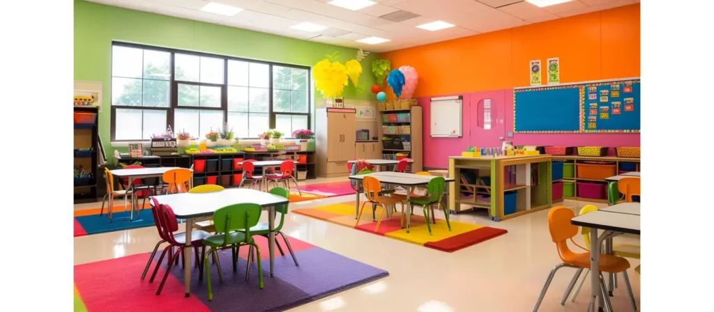
How Classroom Colors Affect the Learning Environment
Each color brings a different psychological effect, which can help guide your decision on which colors to incorporate into your classroom layout. Let’s explore how specific colors can influence student behavior and productivity:

Blue – Calm and Focused
Blue is widely regarded as a color of tranquility and calmness. It has been shown to lower heart rates and reduce stress, making it ideal for creating a peaceful learning environment. It promotes concentration and encourages students to stay focused during lessons. Lighter shades of blue can be great for classrooms where concentration and critical thinking are required, while darker blues create a sophisticated and serene atmosphere.

Red – Energizing and Stimulating
Red is an energizing color that can increase heart rates and stimulate brain activity. It’s often associated with action, excitement, and urgency. While red can inspire energy and creativity, too much red in classroom decorations can cause anxiety or overstimulation. Therefore, red should be used in moderation, ideally in accent walls or accessories, to stimulate energy without overwhelming the classroom.

Green – Balance and Harmony
Green is a color closely associated with nature, balance, and calm. It has a relaxing effect on the mind and body, reducing stress and creating a harmonious environment. Green is particularly effective in classrooms where long periods of study and concentration are required, as it promotes mental clarity and focus. It also enhances creativity, making it an ideal choice for art or design classrooms.

Yellow – Optimism and Creativity
Yellow is often associated with sunshine, optimism, and happiness. It can stimulate creativity and enhance memory retention, making it an excellent color for brainstorming and idea-generation spaces. However, like red, too much yellow can cause agitation or anxiety. Bright yellow accents or soft, pastel yellow walls can help students feel motivated and enthusiastic about learning.

Purple – Creativity and Inspiration
Traditionally linked to royalty and sophistication, purple has a calming and creative effect on the mind. It encourages creative thinking and imagination, making it suitable for classrooms where innovation and original thinking are emphasized. Light purple or lavender tones can create a tranquil space that promotes a sense of calm while sparking inspiration.

Orange – Inviting and Enthusiastic
Orange is an energetic and enthusiastic color that combines the stimulating qualities of red and the warmth of yellow. It often creates an inviting and friendly atmosphere, encouraging social interaction and collaboration. However, like red and yellow, orange should be used carefully, as excessive amounts can lead to overstimulation. Using orange for accent walls or accessories energizes the space without overwhelming it.

White – Clean and Neutral
White is the color of simplicity and purity. It offers a neutral backdrop that makes other colors pop and gives the classroom a fresh appearance. White also reflects light well, helping to brighten a room. While it can create a sense of openness, too much white can feel sterile or unwelcoming. To avoid this, incorporate other colors through furniture, artwork, or accent walls.

Gray – Professional and Subdued
Gray is often seen as a neutral and professional color. It conveys stability and balance, creating an environment conducive to serious work and focus. However, too much gray can feel drab and uninspiring. Combining gray with warmer or more stimulating tones like orange or yellow is best to prevent the classroom from feeling too dull.

Brown – Grounded and Stable
Brown is a grounded, earthy color that can create a cozy, stable environment. It’s often associated with reliability and support. When used in classrooms, brown can promote security, making students feel comfortable and supported. However, too much brown can make the space dark or overly heavy. It’s best to use it as an accent or secondary color.
Tips for Selecting the Right Classroom Colors
Selecting the right colors for your classroom isn’t just about picking hues that look good together. There are several factors to consider to ensure that the colors contribute positively to the learning experience:
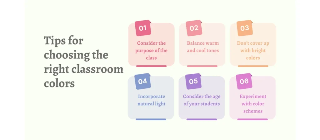
1. Consider the Purpose of the Classroom
The purpose of the classroom should guide your color choices. For example, calm colors like blue and green are ideal in a math or science classroom where focus and concentration are key. For an art room or creative space, colors like yellow or purple can help spark creativity. Similarly, in a reading or language arts classroom, soft and neutral tones create an environment conducive to focus and introspection.
2. Balance Warm and Cool Tones
A good color scheme strikes a balance between warm and cool tones. Warm colors like red, orange, and yellow can energize students, while cool colors like blue and green promote relaxation and concentration. You can create a balanced and dynamic space by incorporating warm and cool tones.
3. Don’t Overwhelm with Bright Colors
While bright colors can be energizing, using too many shades can overwhelm. It’s essential to strike the right balance. Consider using vibrant colors for accent walls, furniture, or decor, while keeping most of the room in neutral or calming colors. This creates a lively yet harmonious environment.
4. Incorporate Natural Light
Colors react differently depending on the amount of natural light in a room. Bright colors may look even more vibrant in natural light, while darker colors can make a room feel smaller and more enclosed. Remember how much light your classroom receives and adjust your color choices accordingly.
5. Consider the Age of Your Students
The age of your students can also play a role in selecting colors. Younger children may respond better to vibrant, playful colors like red, yellow, and blue, which can stimulate their imagination and energy. Older students may benefit from more subdued tones like blue and green, which can help foster concentration and focus.
6. Experiment with Color Schemes
Experiment with different color schemes if you’re unsure which colors to choose. Use online tools or design software to create mockups of how the room would look with different colors. You can also paint small wall sections in different colors to see how they look in the space before making a final decision.
Classroom Furniture Colors
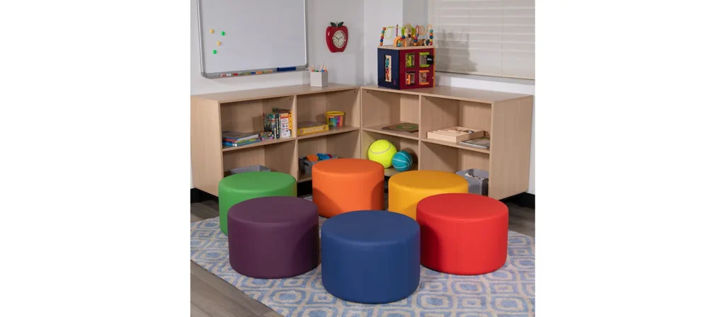
Classroom furniture colors are vital in the overall color scheme and how students interact with the space. Selecting colors for desks and chairs, shelves, and furniture should align with the classroom’s intended atmosphere. For instance, if the aim is to create a calm reading corner, blue or green furniture can enhance the calming effect. Conversely, warmer colors may be better suited for areas meant to inspire creativity or excitement.
Practical Considerations for Classroom Furniture Colors
While aesthetics are essential, durability and ease of cleaning are crucial when choosing classroom furniture colors. Neutral tones like gray or beige are often chosen for their versatility and resilience to wear and tear. These colors can provide a stable foundation, with vibrant accent colors on items like chairs or storage bins, to add energy without overwhelming the room.
Additionally, age appropriateness should be considered. Younger students may respond better to brighter, playful furniture colors, while older students prefer subdued tones that match a more mature learning environment.
Balancing Function and Style in Furniture Design
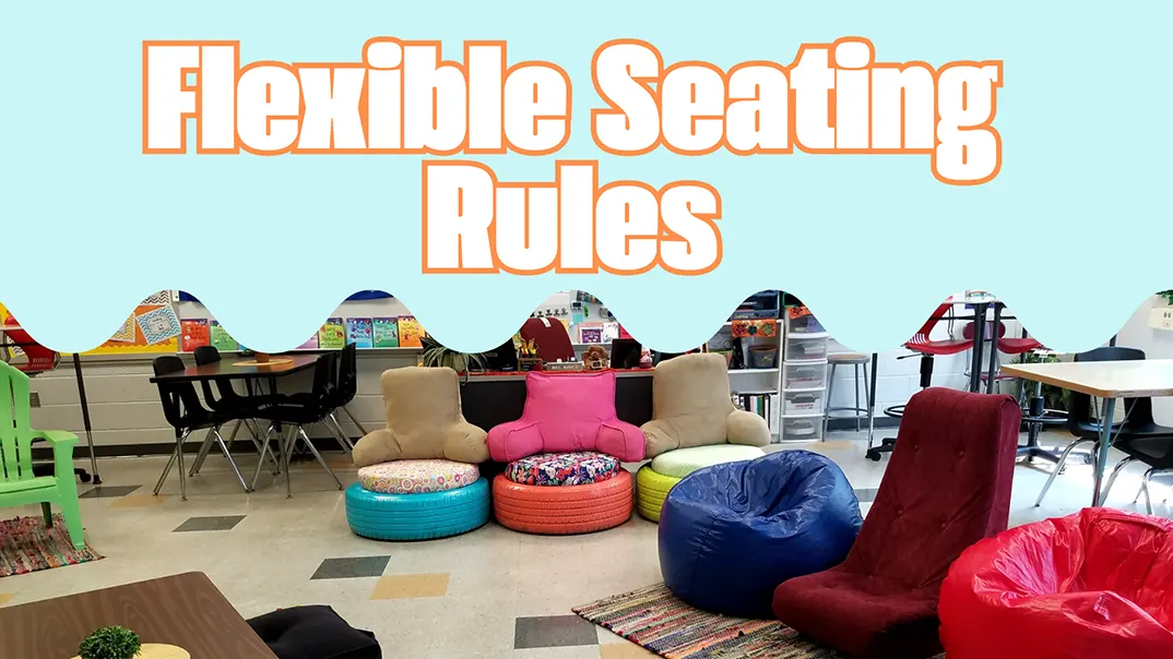
Furniture should complement the room’s function. For example, desks and chairs in collaborative zones might benefit from stimulating colors to foster engagement, while independent study zones should prioritize calmer tones. Flexible seating options also allow for color diversity, giving students a choice and adding variety to the classroom aesthetic.
Discover Our Full Range of Products
Get access to our comprehensive catalog featuring top-quality furniture and play equipment for kindergartens and schools.
Lighting and Classroom Colors: Creating the Right Ambience
The influence of color is closely tied to lighting, as natural light can alter the perception of colors within a classroom. Classrooms with ample natural light may benefit from cooler colors that prevent overwhelming brightness. In contrast, rooms with limited natural light can use warm or neutral colors to create a more inviting feel.
Artificial lighting should also complement the color scheme. For instance, LED lights with a natural white hue can enhance colors like blue and green, supporting a focused learning environment. Warmer artificial lighting works well with beige or orange accents to create a cozy atmosphere that’s conducive to reading or collaborative work.
More Related Questions
- What color is best for a classroom?
Blue and green are often ideal for promoting focus and calm, while yellow and orange can inspire creativity and energy. - Does lighting affect classroom colors?
Yes, natural and artificial lighting influences how colors are perceived, impacting their effectiveness in creating desired moods. - Are bright colors distracting for students?
Bright colors can be distracting if used excessively. However, they are beneficial in moderation, especially for younger students. Small pops of bright colors in targeted areas can make a classroom feel lively without overwhelming students. - Is there a difference in how colors affect different age groups?
Absolutely. Younger students respond better to bright, primary colors, while older students benefit from cooler, more subdued tones. Tailoring colors to age-specific preferences can help maintain an age-appropriate learning environment. - How can teachers incorporate color without changing the entire classroom?
Teachers can use colorful posters, cushions, rugs, or storage bins to add color without repainting walls. Small decor items can add personality to the classroom while leveraging color psychology.
Conclusion
Classroom colors are powerful tools that shape students’ moods, behaviors, and learning outcomes. Educators can create classrooms that support a positive, focused, and collaborative atmosphere by understanding and applying color psychology. Strategic color choices bring together functionality, aesthetics, and psychology to foster spaces where every student has the opportunity to excel.

